The search for Helvetica also yielded some disturbing results. Though I am curious at what something titled "helvetica wet and wild" would be, because what I'm picturing in my head largely involves a bunch of letters splashing themselves under a water hydrant. Then there's the irony in titling something "helvetica uncensored", would a censored version just have missing letters? Or maybe they'd all be bolded?
Part II of my font seeking adventures. At least they are being honest. *sigh*
But damn, I still want Futura.

edit: Actually, I really like Frutiger. I don't really like Helvetica that much, but its complete neutrality lends itself to any application. Arial looks alright in isolation, but as soon as you use it in typography, it looks really ugly; Times New Roman is far better. Verdana as a standard font looks pretty nice, I think the kerning is a bit off though.
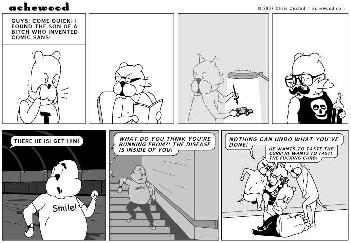
double edit: Wow, this may very well be the most pretentious post I've ever made. Here's a reward for sticking around.
No comments:
Post a Comment